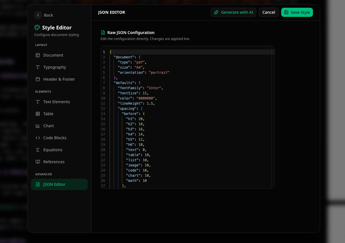
The visual Page Design workspace supports document styling master
pages, first/odd/even variants, reusable multi-row regions, mirrored margins,
backgrounds, and repeating page decoration. Existing documents and presets
remain fully supported. Legacy rendering remains available until a style is
explicitly upgraded. See
Document Styling.
How styles work
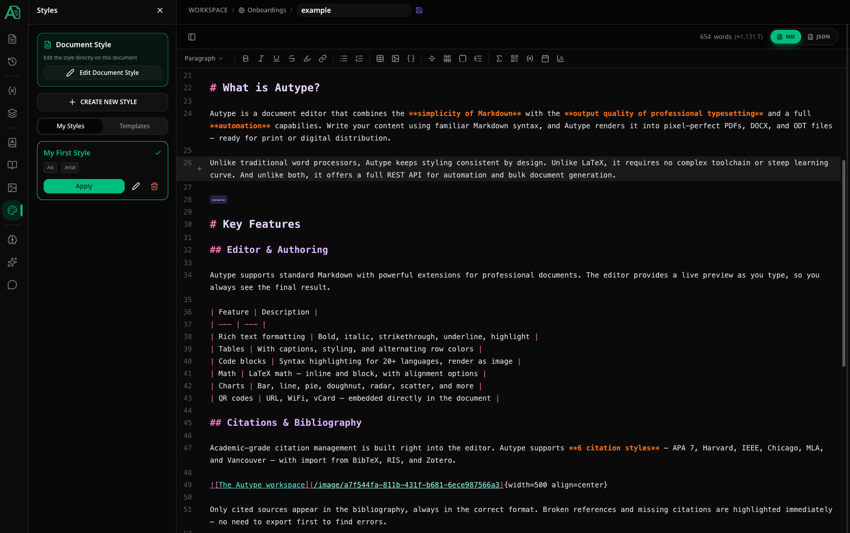
Styles in Autype follow a copy-on-apply model:- You create a style preset (or choose a template) that defines fonts, colors, spacing, headers, footers, etc.
- When you click Apply or Use Template, the style configuration is copied into the document. The document now has its own independent copy of that style.
- You can further customize the document’s style via Edit Document Style at the top of the panel. These changes only affect the current document.
Permissions and shared assets
Company styles and their images are readable across the organization so team members can consistently reuse logos, backgrounds, headers, and footers. Creating or changing a company style requires a licensed organization member; changing the organization default requires an organization owner or administrator. Applying a style never grants additional document access. The user must already have edit permission for the target document. Images used by a company style are copied into that document during application, which keeps existing documents independent from later preset changes. Autype prevents deletion of a company image while any style preset still references it. Remove or replace the image in those presets first. For users who belong to multiple organizations, the target organization must be selected explicitly when creating styles or uploading style images.Sidebar overview
The panel has two main areas at the top:- Document Style — click Edit Document Style to open the Style Editor and modify the current document’s styling directly. Changes apply only to this document.
- Create New Style — creates a reusable style preset that can be applied to any document.
My Styles
Lists style presets available to your organization. Each card includes a cached PDF preview, name, description, page size, and default font. Actions per style:- Apply / Re-apply — applies the style to the current document
- Edit — opens the Style Editor to modify the preset
- Delete — permanently removes the preset
Templates
Autype ships 30 complete schema-version-2 system styles covering executive reports, consulting and sales proposals, legal memoranda, research papers, journal manuscripts, ESG and nonprofit reports, clinical reports, financial statements, audit and compliance reports, whitepapers, product requirements, employee handbooks, invoices, policy briefs, investment memos, brand brochures, board minutes, and operations playbooks. Each system style includes typography, element styles, page geometry, background decorations, reusable header/footer regions, tables, forms, charts, references, and PDF/DOCX-safe defaults. Choose Use Template in a document to attach the immutable built-in style directly; no workspace copy is created. Choose Customize in the Workspace Library only when you want an editable, independently named preset. The built-in source is never modified. The thumbnails are prerendered from the exact shared definitions with the production document renderer. A catalog manifest hashes both definition and image, and the image hash is used as the browser/CDN cache key. Production builds fail when a definition changes without regenerating its preview, so users never receive a stale or per-card runtime placeholder.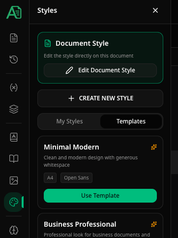
Style Editor
The Style Editor is a full-screen design studio. Page Design uses a large, zoomable page canvas. Click the page, header, or footer to open only the tools for that area; close the inspector to use the full canvas width. Typography, text elements, tables, fields, charts, code, and references remain focused setting areas with a rendered PDF preview. The style name is always available in the top bar, so it is not hidden inside one tab.Page Design
Page Design is the primary workspace for physical page layout:- switch directly between Master, First page, Odd, Even, Section first, and Blank;
- use the always-visible Page setup control to choose A3, A4, A5, Letter, or Legal format and portrait or landscape orientation;
- click the dashed content area, header, or footer directly on the page to open its contextual editor;
- drag the blue margin guides on the page or enter exact millimetre values;
- drag the two horizontal handles on a selected header or footer to change its distance from the page edge and its minimum height;
- zoom the editing canvas in or out without changing the document;
- switch to a two-page spread to review odd and even pages together;
- set page background colors, gradients, images, content columns, and classic side strips;
- create a header or footer from the visible empty area on the page, or reuse an existing region;
- empty headers, footers, and region cells remain visible as dashed click/drop targets, so adding the first element does not require finding a form field;
- choose a visual one-, two-, three-column, or two-row layout in the region inspector;
- drag text, fields, images, lines, variables, spacing, QR codes, and shapes from the persistent element palette into any header or footer column;
- drop several elements into the same column to stack or arrange them there;
- select an element directly on the page to edit, reorder, replace, or remove it in the contextual inspector;
- click an individual header or footer cell to set its horizontal left/center/right/stretch alignment and vertical top/middle/bottom/stretch alignment;
- use custom grid controls only when the visual presets are insufficient;
- undo and redo local changes while structural, physical-layout, DOCX, and PDF compatibility feedback remains visible in the bottom bar.
Typography
Set the global default font and configure heading numbering, figure captions, table captions, and code captions.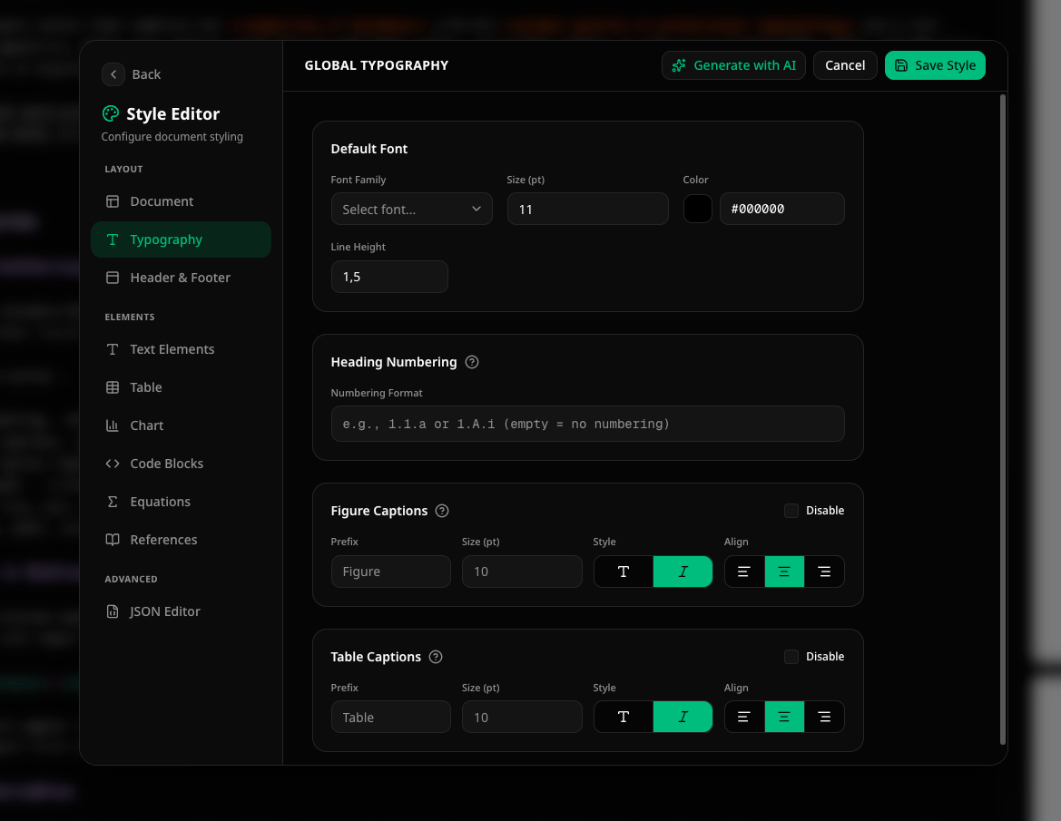
Heading Numbering — automatically numbers headings using a format string:
Example:
1.1.a produces headings like 1. Title, 1.1 Section, 1.1.a Subsection.
Figure Captions — controls how image and chart captions are rendered:
A figure caption renders as: Figure 1: Your caption text. The number is auto-incremented across the document. Set the prefix to
"Abb." for German documents or "Fig." for abbreviated English.
Table Captions — same options as figure captions but for tables. A table caption renders as: Table 1: Your caption text (prefix defaults to Table).
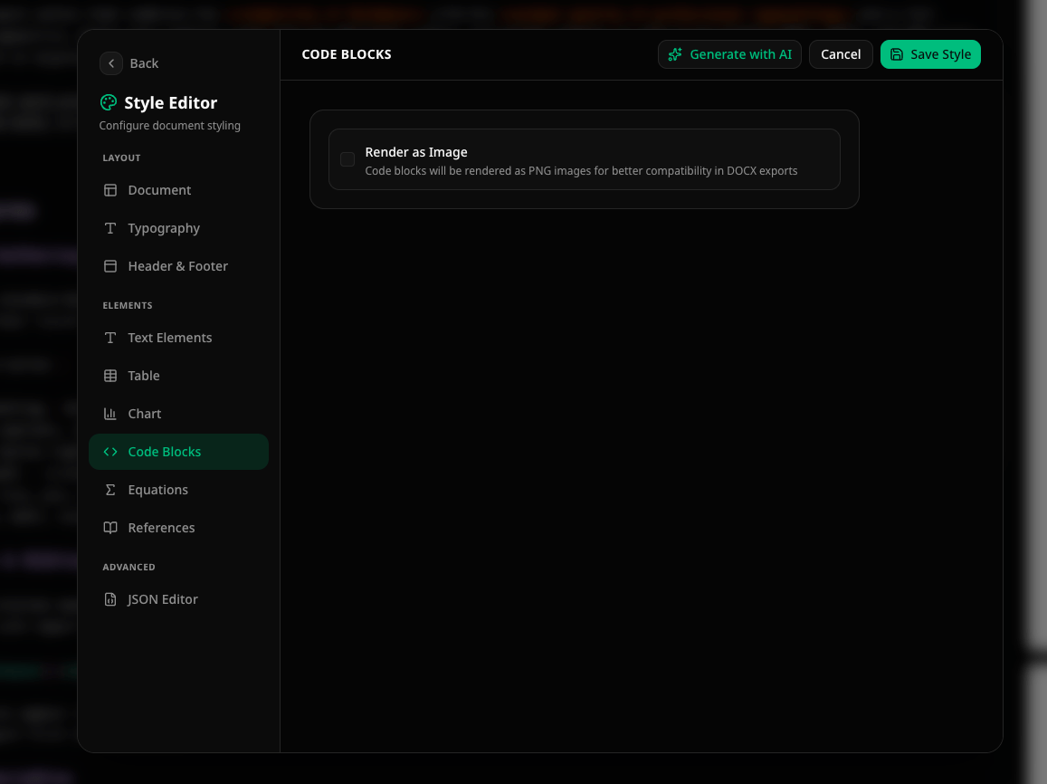
Code Captions — same options as figure captions but for code blocks. A code caption renders as: Listing 1: Your caption text (prefix defaults to Listing). Code blocks with a caption are automatically collected in the List of Code Listings.
Diagram code blocks (e.g.,
mermaid, plantuml) use the Figure Captions style when rendered as images. The Code Captions style applies when renderAsImage=false or for non-diagram code blocks.Header & Footer
Existing legacy left, center, and right values are normalized into the visual canvas without changing the stored style. Click the header or footer directly on the page to inspect it. Choose Convert to visual design before making changes; the legacy fields remain supported by import, validation, and rendering. The old three-position form is no longer a separate navigation item. This avoids presenting two competing header/footer editors for the same style. Drag one or more blocks from the persistent element palette into a header or footer column:
Available variables for text mode:
Use the First page variant to hide, replace, or redesign the header or
footer on the title page. Variants inherit the master until they are changed.
Text Elements
Configure the typography for each heading level (H1–H6) and two body text styles (Text, Text 2). Each element can override the global defaults.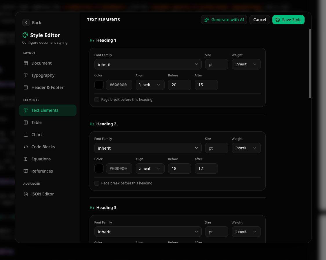
Tables
Control the visual appearance of tables in your document.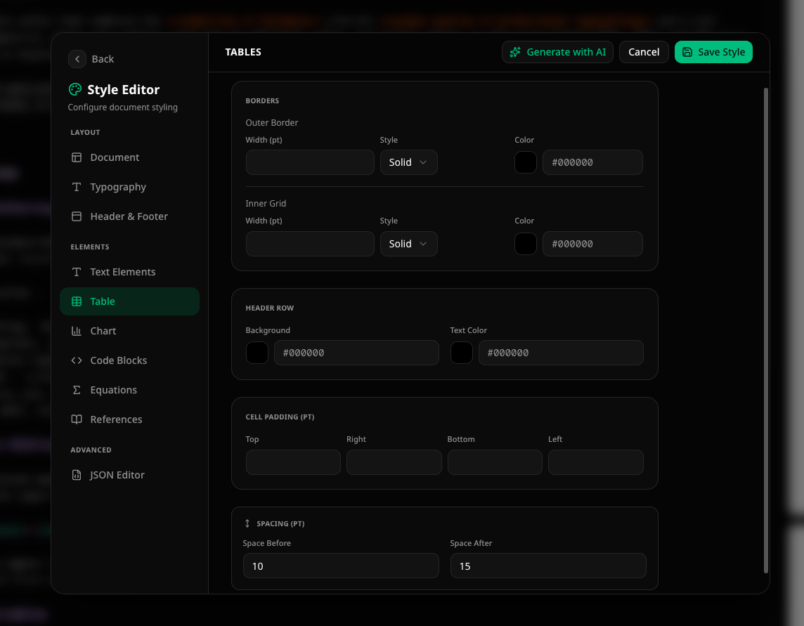
Header Row — background color and text color for the first row.
Cell Padding — top, right, bottom, left padding in points.
Spacing — space before and after the table element.
Form Fields
The Form Fields section controls document-wide defaults for text, number, date, multiline, choice, signature, and initials controls.
These values are stored in
defaults.styles.formField and
defaults.spacing. A field can override them locally from its context toolbar.
Charts
Configure the color palette used for chart series.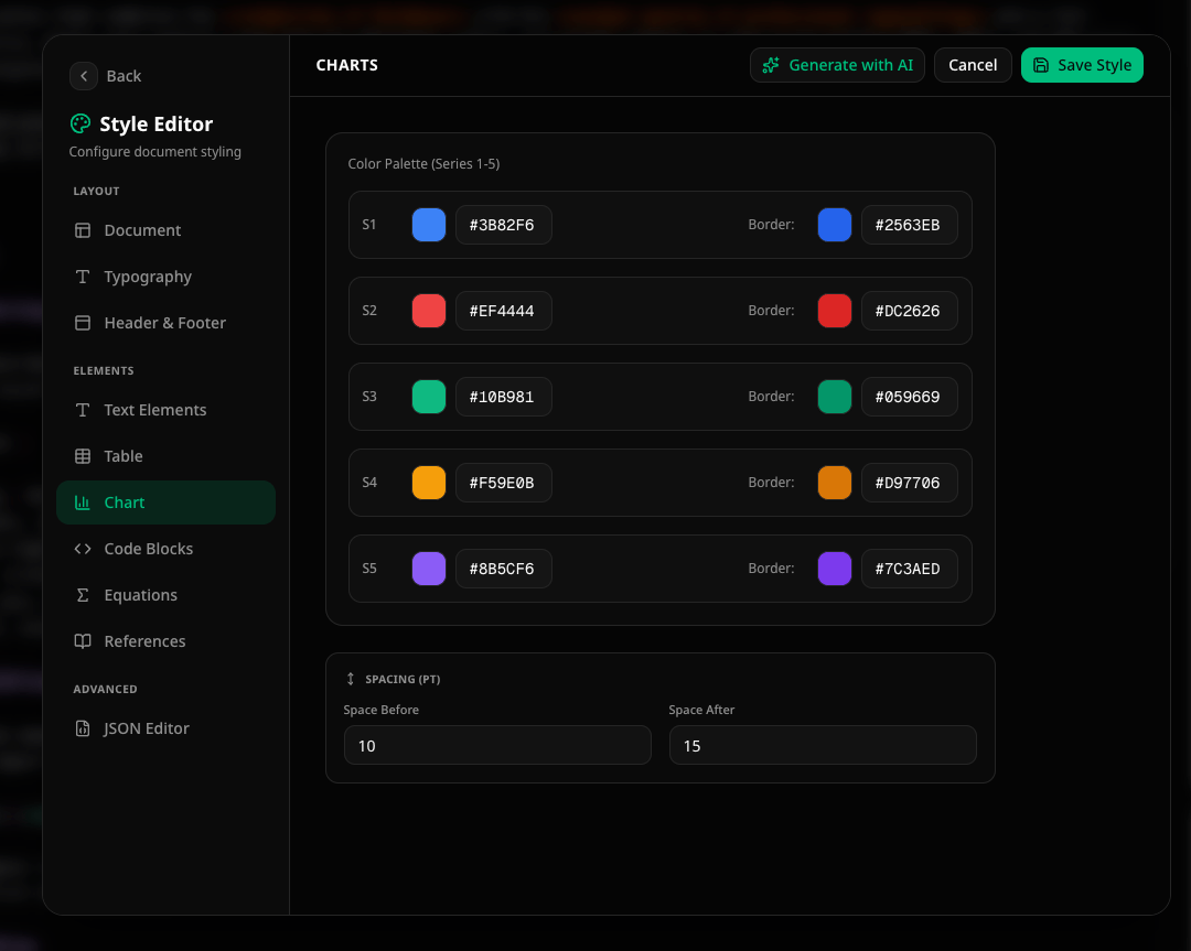
Code Blocks
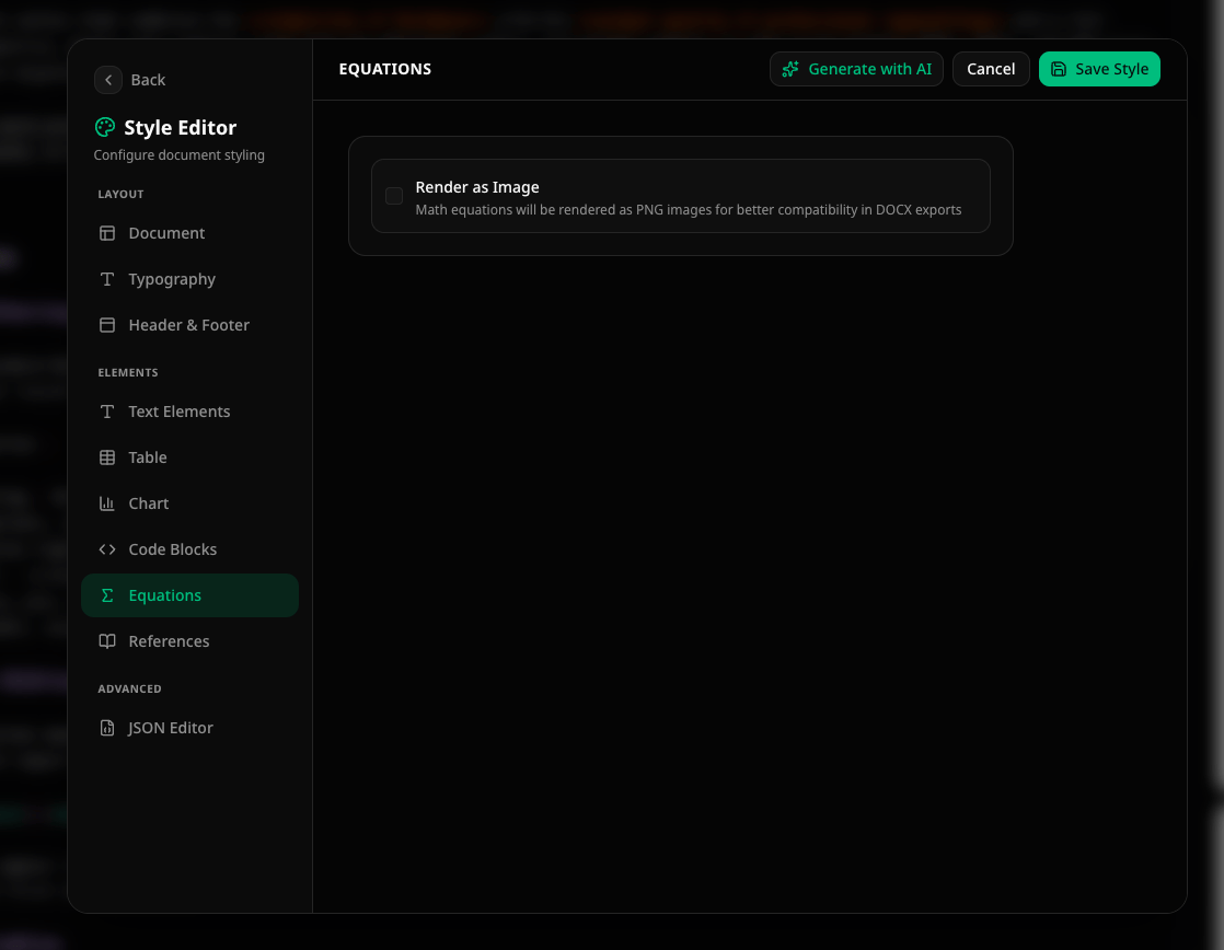
Equations
References & Citations
Configure the styling for reference links, the List of Abbreviations, and the bibliography.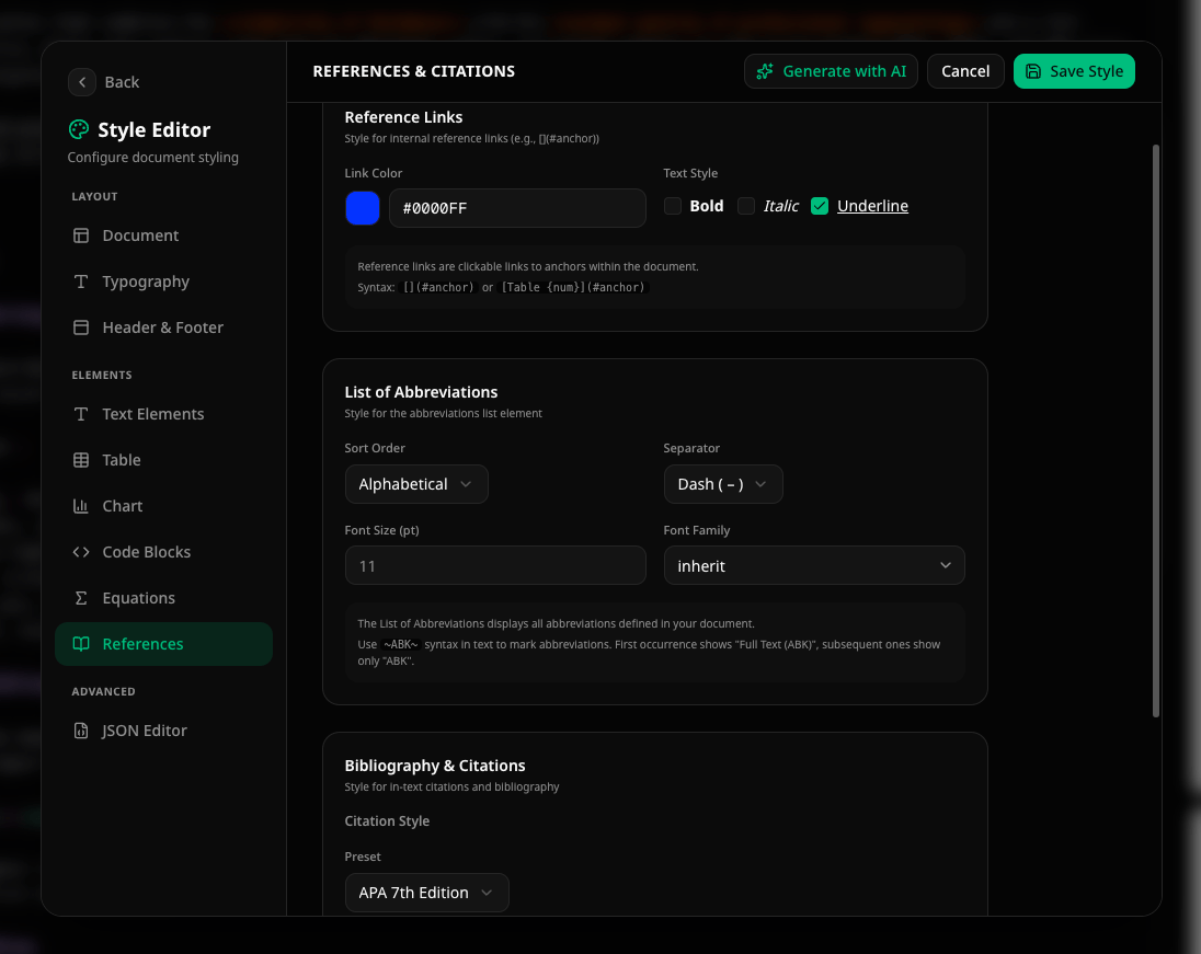
[](#anchor)):
List of Abbreviations:
Bibliography & Citations:
JSON Editor
For advanced users, the JSON Editor provides direct access to the raw configuration object. Changes are applied live as you type.